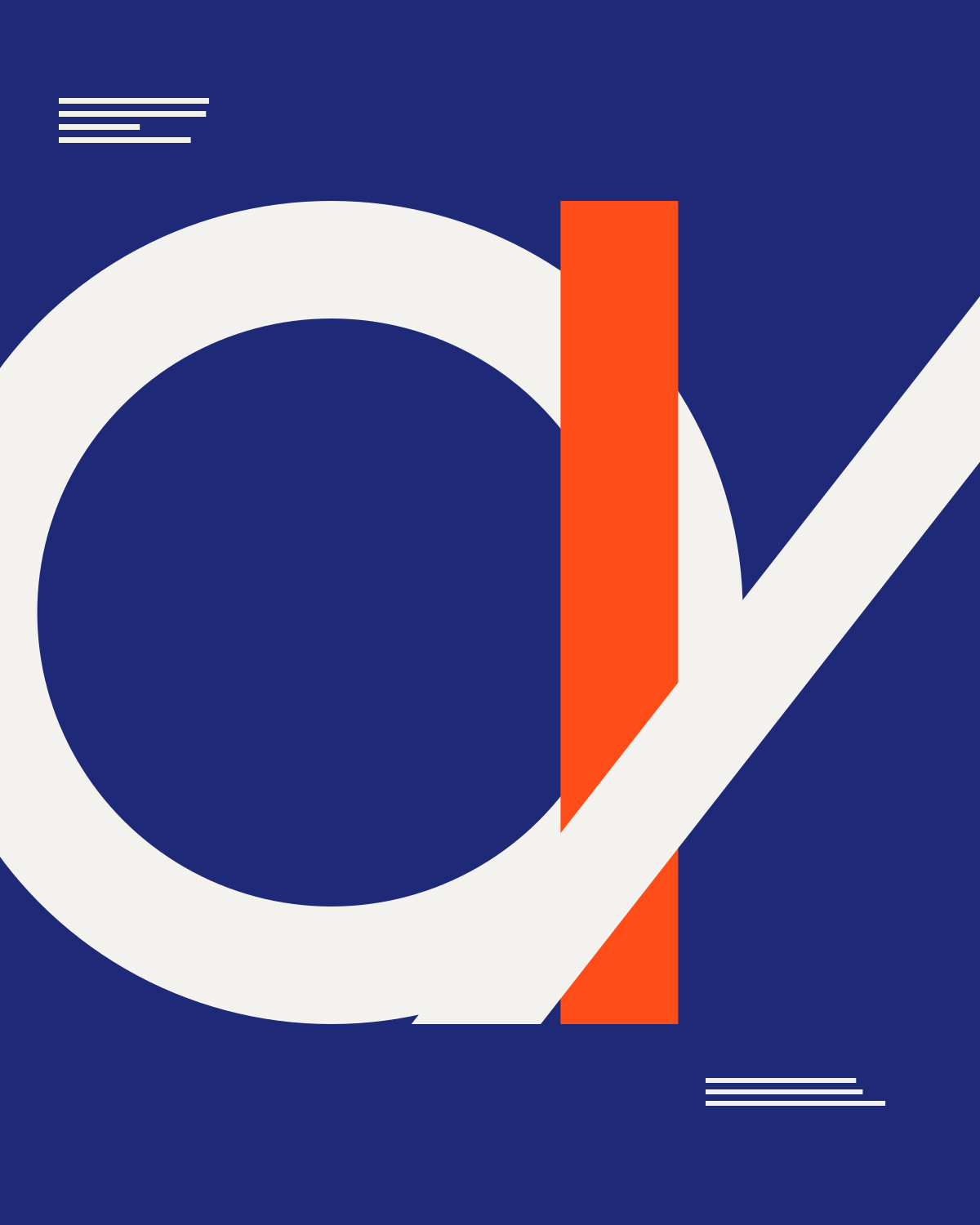
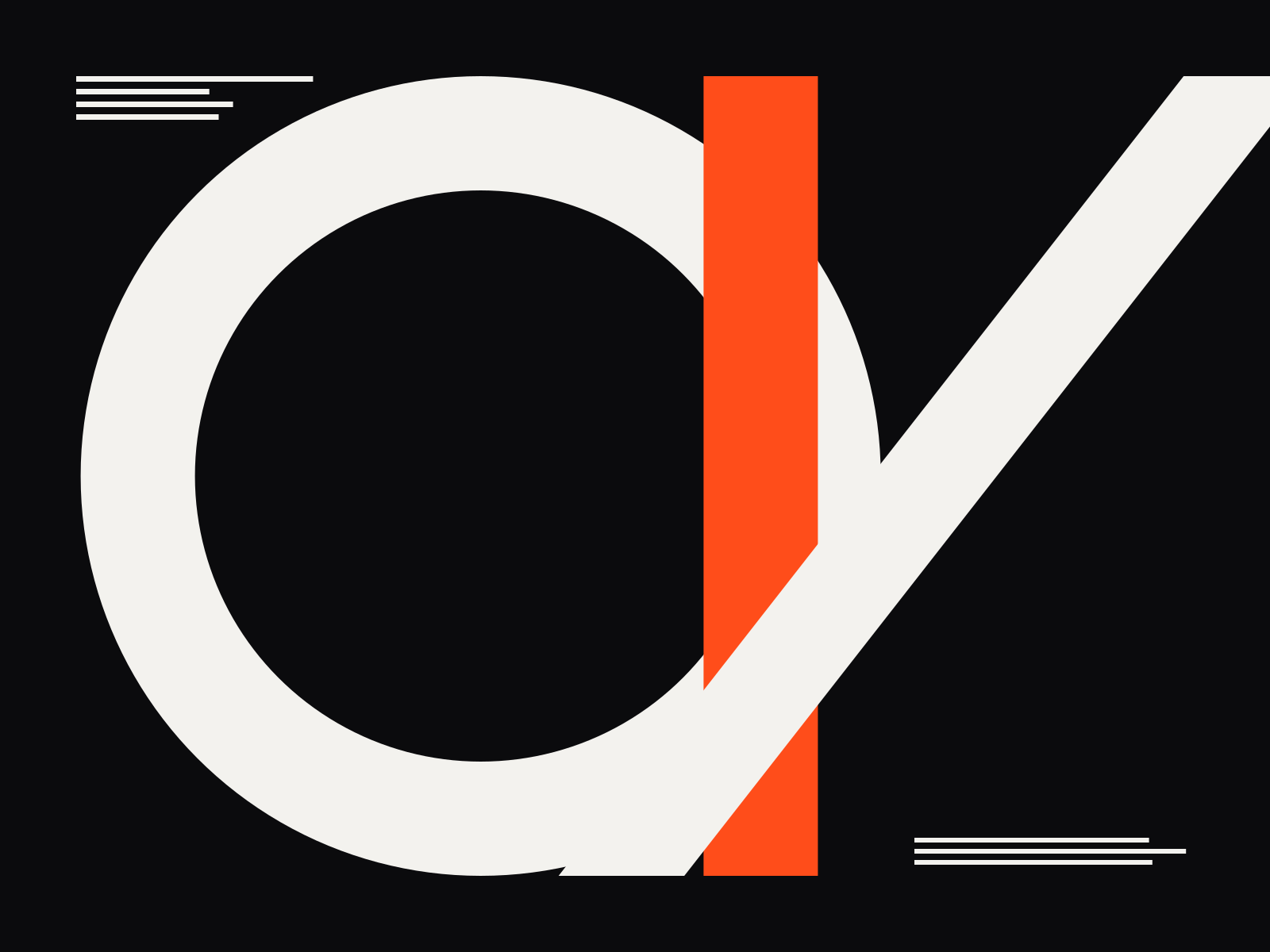
A modular identity for an electric ferry network, built from the shape of a hull and the rhythm of a timetable.
- Client
- Halvard Ferry Line
- Year
- 2026
- Disciplines
- Branding & Identity, Graphic Design
- Industry
- Transport & Mobility
- Deliverables
A token that travels
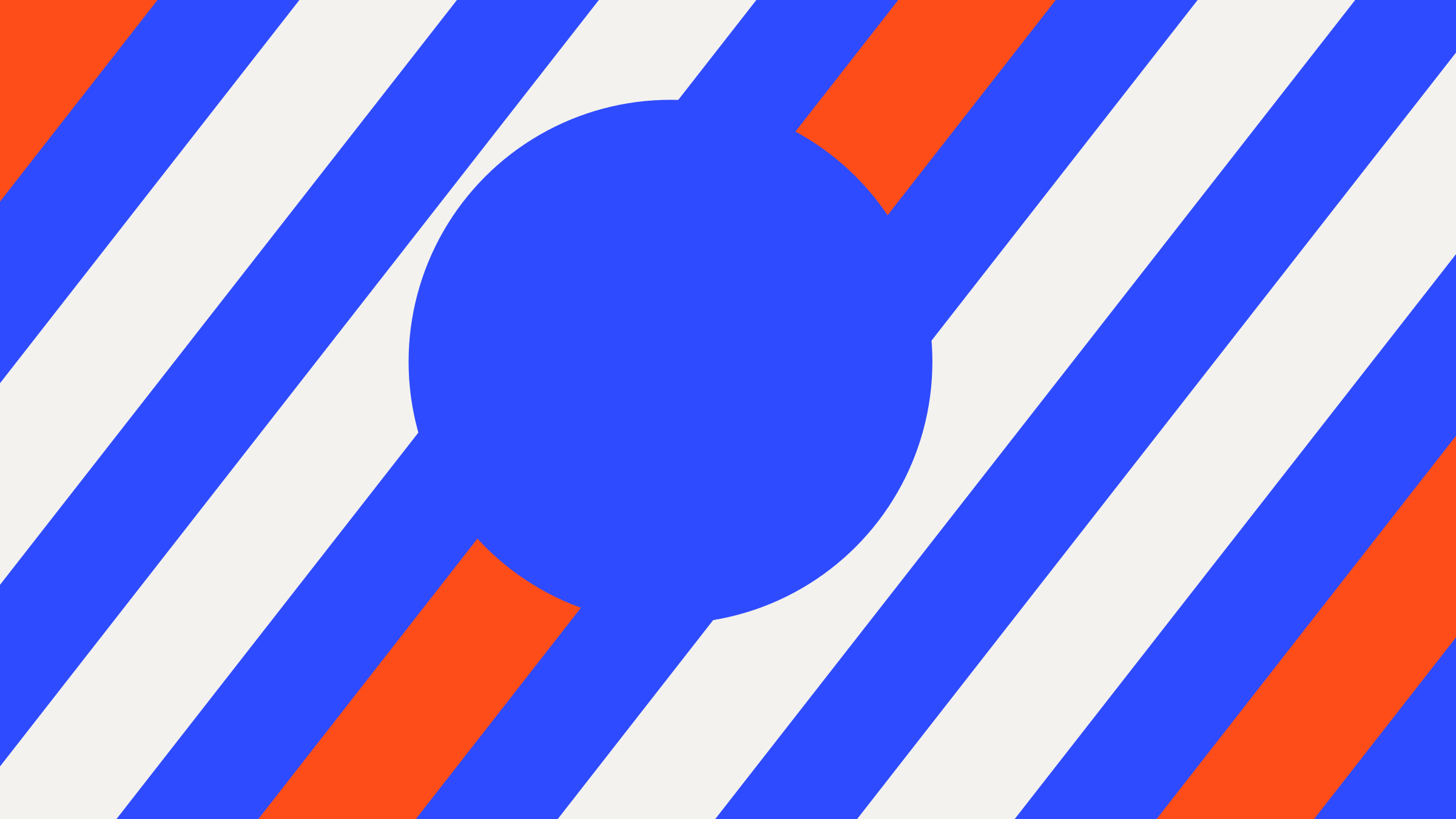
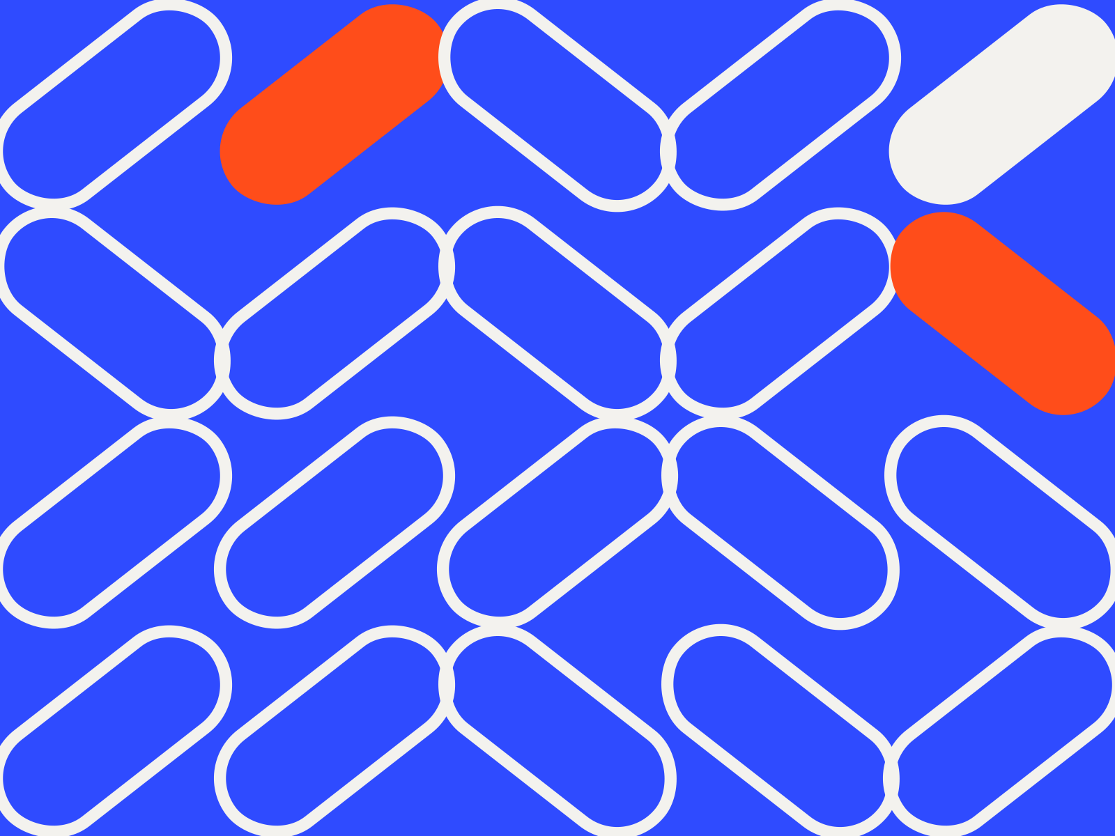
Each route is a capsule that stretches with distance. On a map it becomes a line; on a ticket, a badge; on a pier, a sign you can read from the water.

- Routes, one system
- 6
- Pictograms drawn
- 42
- Timetable typeface
- 1
We wanted a brand you notice when you need it and forget when you don’t.
Project notes
Overview
Halvard is a fictional coastal ferry operator moving its fleet to electric power. The brand needed to feel calm, civic and quietly confident — something passengers trust at 6am in the rain.
Challenge
Six routes, three vessel types and a timetable that changes with the seasons. The old identity was a patchwork of signs, flags and printouts that no one could read at a glance.
Approach
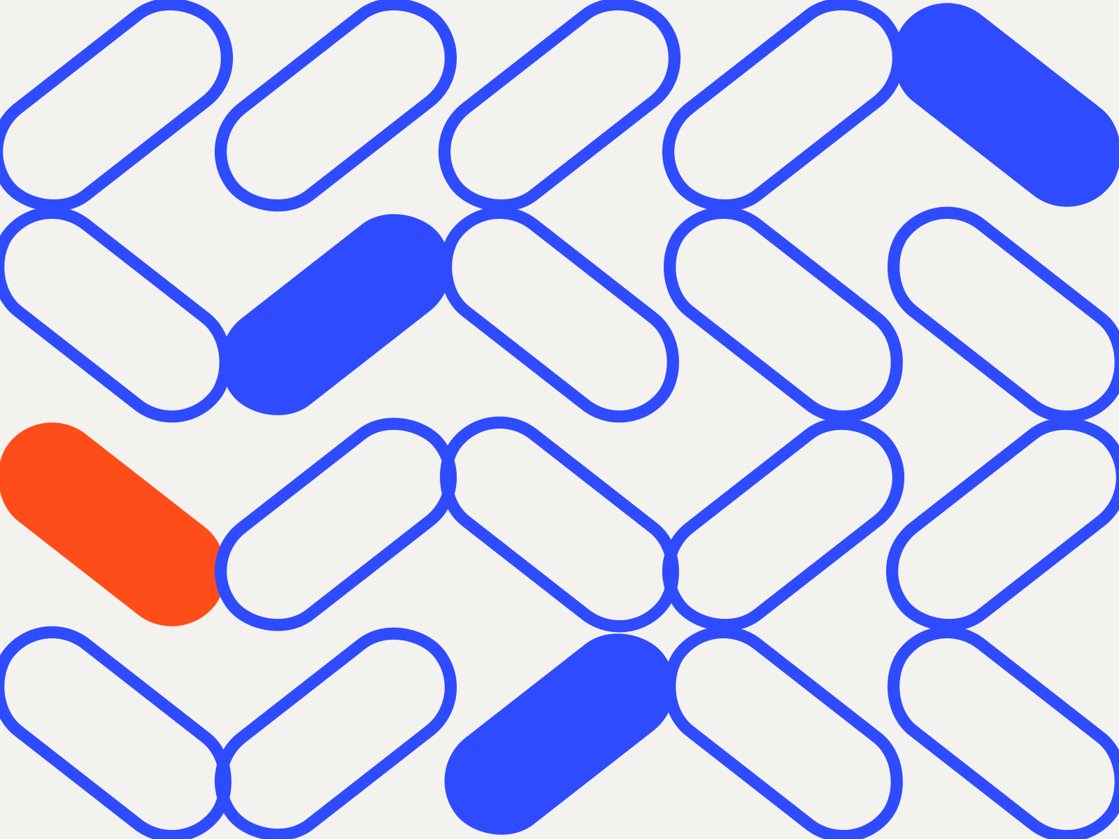
We designed a system rather than a logo: a capsule-shaped route token that stretches with journey length, a wayfinding grid that works from a phone to a pier, and a colour logic tied to each route.
Process
Sketches on site, cardboard signage prototypes on real piers, and a timetable typeface tuned for legibility in low light.
Outcome
A complete identity toolkit — from hull livery and flags to app icons, tickets and signage — documented in a living online guideline.
- Creative direction
- Mira Okafor
- Design
- Capsul Identity Team
- Wayfinding
- Tomas Reyes

Next project →
Northlight Atlas